The Chicago Bears are one of the oldest and most storied franchises in the NFL, and their logo is a significant part of their identity. Much like the team itself, the Bears’ logo has a rich history that reflects the evolution of the franchise and the league.
Let’s take a trip down memory lane and explore the journey of the Bears’ logo from its inception to its current iconic design.
The Early Days: The First Logo (1920s-1940s)
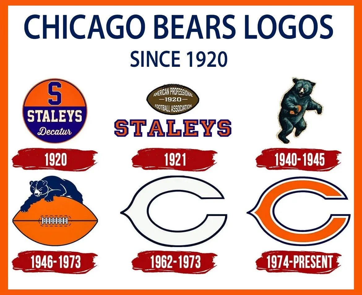
The Bears were founded in 1920 as the Decatur Staleys, and it wasn’t until they moved to Chicago and became the Bears in 1922 that the team began to establish its own unique identity. The early Bears logo was a simple, straightforward design featuring a bear standing on all fours. It was a nod to the team’s rugged, no-nonsense style of play, and it set the tone for the franchise’s future branding.
During the 1940s, the Bears’ logo underwent a significant transformation. The design was updated to feature a more aggressive bear, standing on its hind legs and ready to pounce. This new look symbolized the team’s tenacity on the field and helped establish the Bears as a dominant force in the NFL.
The Introduction of the ‘C’ (1962)
In 1962, the Bears introduced a logo that would become one of the most recognizable symbols in all of sports — the orange ‘C’. This design was a departure from the more literal bear imagery of previous logos. The sleek, simple ‘C’ was inspired by the wishbone ‘C’ of the Cincinnati Reds, but with an orange hue that made it uniquely Bears.
This change marked the beginning of a new era for the franchise, one that emphasized a modern, streamlined identity. The ‘C’ logo was a bold move, and it paid off, quickly becoming synonymous with the Bears and their storied history. It represented a team that was not just about brute strength but also about precision and strategy.

Evolution of the ‘C’ Logo (1974)
In 1974, the Bears made a subtle yet impactful change to their logo. The orange ‘C’ was outlined in white, giving it a more polished and dynamic appearance. This small tweak helped the logo stand out even more, especially against the team’s navy blue helmets. The enhanced visibility of the ‘C’ on the field reinforced the team’s branding and solidified its place in the pantheon of iconic sports logos.
This version of the logo has remained largely unchanged since then, a testament to its timeless design. The simplicity and elegance of the ‘C’ have allowed it to endure through decades of NFL history, becoming a symbol of consistency and tradition.
The Alternate Bear Head Logo (1999-Present)
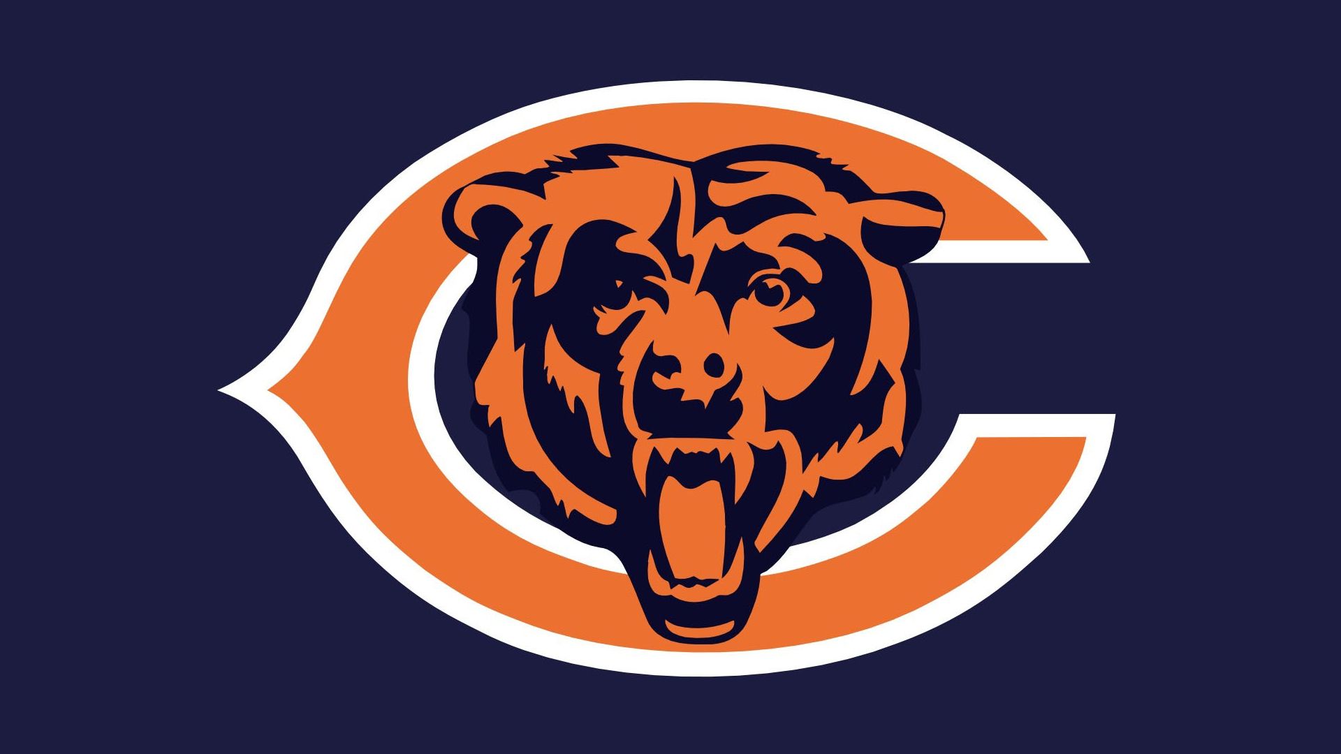
While the ‘C’ remains the primary logo, the Bears introduced an alternate logo in 1999 that features a fierce bear head. This design serves as a nod to the team’s early logos, bringing back the imagery of an aggressive, snarling bear.
The bear head logo is often used on merchandise and as a secondary emblem, offering a more detailed and modern representation of the team’s spirit.
This alternate logo adds another layer to the Bears’ branding, allowing fans to choose between the classic ‘C’ and the more intense bear head. It demonstrates the team’s ability to honor its past while embracing a fresh and bold look.

